
It is one thing to find some sense and order to the chaotic processes that dominate long term environmental catastrophes; it is another thing entirely to take these observations and throw them together into a model that can be used to better represent hazards at hand. While this monumental task takes teams of scientists working together, the presenter for this past week’s Van Tuyl lecture series, Dr. Christa Peters-Lidard of NASA Goddard, was at her best presenting on how everyone, herself included, helped to build models that will revolutionize drought modeling. Peters-Lidard, who got her Ph.D. at Princeton, acts as the chief physical scientist at NASA Goddard in the hydrological sciences laboratory. Recently the lab has been working to pull from the somewhat abbreviated physical data on droughts to build reliable models. Beyond simple drought modeling, her team has done their best to add in other variables, such as soil moisture, stream flow, and snow pack, to the mix. There were no punches held as Peters-Lidard announced that “drought is a high-impact hydrological event.” Within the past decade many areas of the United States have been affected by varying levels of drought, most notably the entire state of Texas and most of Southwestern United States.
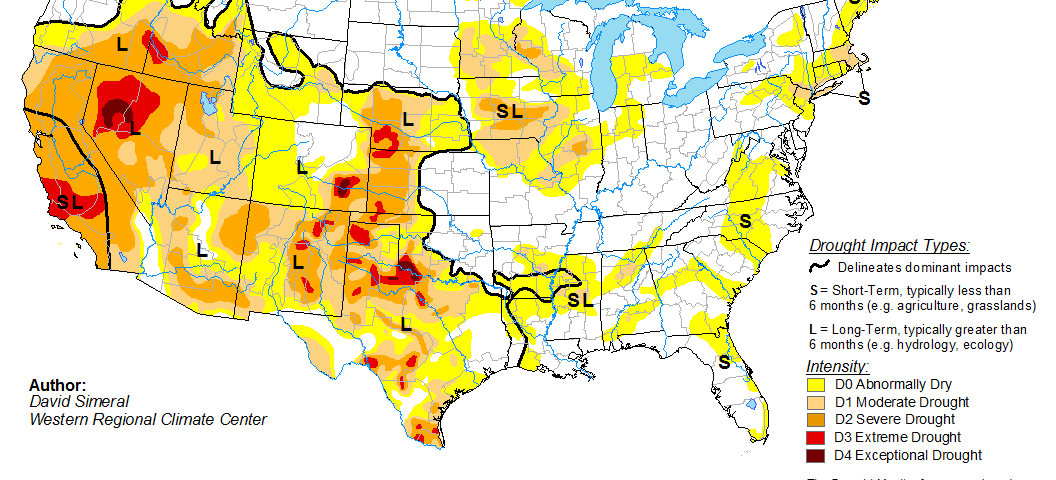
Peters-Lidard began the bulk of the presentation by putting up a drought map of the United States and inquiring, “How many of you have seen a map like this before?” With a bit of hidden insight into the map Peters-Lidard continued with her sense of humor, “It’s like watching sausage get made, you find yourself thinking, ‘Oh really, that’s how it works.'” For the most part, the current drought mapping process involves a very simple model which uses some incredibly simplified assumptions to build a very key and essential map. With a few minor adjustments for certain areas of the country, the data is seen by an analyst, who then decides what is right and contours the data to make the map. “It is a very labor intensive process,” admitted Peters-Lidard. After the analyst determines the map, the map is then cross checked with people in the field across the country, and once everyone is happy with the data, it is published like any normal scientific document. The data is presented as a contoured map which reflects the stage of a drought, ranging from D0, which means that there is the potential for drought to occur, to D4, which reflects extreme conditions, such as the recent Texas drought. Each number represents a percentile range in order to reflect an objective analysis.
One might ask, where does Peters-Lidard fit into all of this? The current model solely uses current observations and does not reflect what might happen, just what has happened. It was the task of Peters-Lidard and her team to analyze several case studies in order to build a predictive model. While the data set used was limited, it only started in 1999, so no dust bowl or other history-changing droughts, there have been several notable events since the monitoring began. One of the major tasks that was set forth was to try to establish some of the basic forces behind droughts that may not have been fully evident using technology that could gather data fast, without much of the issues that are brought about by having humans report back. “When you’re monitoring drought… what we are looking for is a method that uses remote sensing and models,” said Peters-Lidard. Added to that is some semblance of accuracy to the data. The original data that had been collected was very broad and lacked the in-depth detail that was needed for precision modeling, and luckily, as Peters-Lidard relieved, the data got better over time. Echoing the sentiments of the prior week’s lecturer Dr. Burke Minsley, Peters-Lidard and her team used four different models, which came together to form a working ensemble that fit the observations.
Data for the modeling were revealed to have an interesting history. In order to do land modeling and the data assimilation that makes the models worth their weight in gold, it is necessary to make the observations for both the field and satellites and the model compatible. First the model is built and then the data is assimilated into the model. Peters-Lidard used the analogy of driving a car to drive the point home: “It is like driving down a road and you start nodding off. The car will keep going in its original direction; that is your model. Then you wake up and find yourself going off the road, so you swerve to get back on; that is data assimilation.” Unlike the tired, but lucky driver in the analogy, data coming into the data assimilation side of the project is less than frequent as it stands; at their best frequency, the satellites will deliver data every day while others may be weekly. Luckily, as brought up later, in the future, data will be much more frequent.
The modeling in question has both good sides and bad sides. On the good side of the coin, the models can be coupled with weather forecasting to give some potency to their claims. On the flip side, the models are simplified, 1D models of a single equation; they do not account for anything deep in the system nor do they account for a host of other important factors. Added to this is the fact that the models were not originally developed for drought modeling; they were originally intended to be used to establish boundary conditions for the atmosphere. The example of snow measurement modeling highlighted some of the unfortunate shortcomings of the whole program. Two separate observations can be done; one highlights the simple question if snow is present or not and the other determines snow water equivalent. While there are future satellites that have attached missions to measure parts of the atmosphere, nothing will be done on the front of snow modeling for a while to come. Of the missions that are upcoming, one of the more insightful is to be used to give nearly hourly updates on precipitation, which should go a long way to adding to the drought modeling.
With all of the necessary background given out, Peters-Lidard turned the presentation in the direction of modeling results. To cover her bases, the audience was informed of some of the basic data filters that would come up. The primary concerns involved the microwave remote sensing data that was used in water measurements; data that is strange has to be thrown out, since it is easy for the microwave remote sensing to pick up anomalies, especially when vegetation is a factor in the area being studied. Other considerations, such as data collection methods were also used to get better data. The first dataset that Peters-Lidard displayed was proclaimed to be rather anti-climactic. The measurements of soil moisture went in the expected direction, but “the sparse soil monitoring stations [did not] give the slam dunk we were hoping for. Much better was the stream flow monitoring. Peters-Lidard used some basic equations to find which data was outstanding and for the most part the data was all important. When the data was then compared to the United States Drought Monitor, it was all over the map. In extreme situations, the data was not what had been hoped for, and, luckily for the models, the less severe instances of drought fit the model quite well. As Peters-Lidard explained these lesser instances are very important since they answer the question, “Have you entered a drought or not?” The question of whether or not a region is in the D0 range or D1 range is important. If a region is in D0, the farmers do not yet qualify for crop insurance; on the other hand, being in a D1 region goes a long way towards getting that important financial protection.
The final portion of the lecture focused on a topic that is close to home for many in the Rocky Mountains: snow. “It is not something you would associate with drought,” said Peters-Lidard. The data for snow was revealed to have its share of problems. For one, snow does not instantly become apparent in a drought system. There is lag between the emplacement of snow-cover and the subsequent melting that helps the land. Like the earlier models, the snow model had some limiting features; the models used were crude, and there were factors that could not be taken into count. With snow, Peters-Lidard revealed, “you have to know something about your data.” The assimilation of the snow data went well, at least for some areas. In the far west, the data was terrible; on the other hand, in the Midwest, it was quite good. Unfortunately, when the whole model came together, the snow didn’t have the impact it should have had.
From the incredibly detailed lecture, Peters-Lidard imparted the crucial bits of advice to understand the data that is being worked with. The happy ending to it all was revealed in the question and answer portion. While the model is not yet being used for prediction work, the scientists that come together to build the drought maps have been comparing their maps to the model. As the modeling goes forward and more data points are added, hopefully reliable drought predictions can become a norm.
'The complicated history of modeling droughts' has no comments
Be the first to comment this post!